Responsive Web Application
The Responsive Web Application template includes several adaptive web pages based on DevExpress ASP.NET AJAX controls or MVC extensions. You can use the layout elements from this template to create an adaptive layout in your application.
Refer to the Getting Started with Responsive Web Application Template article for more information about the template
The template provides the following standard solutions frequently used to build adaptive layouts:
-
Navigation bar
-
Side menus
-
Sticky toolbar
-
Sticky footer
Navigation Bar
A navigation bar (navbar) is a fixed-height toolbar at the top of a page. This template incorporates a "sticky" navbar - this element "sticks" to the top of the page and does not move when end users scroll the page.
The navbar contains the following elements:
-
A hamburger button - collapses/expands a left sidebar
-
An image with the company's logo and title. Only the logo is displayed on mobile devices
-
A responsive menu that transforms into the button on devices with the narrow screen. When this button is clicked, menu items are displayed in a popup window.
-
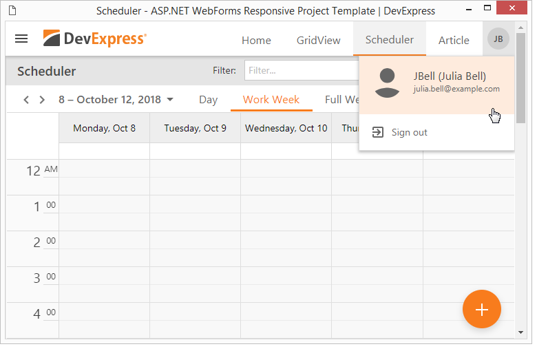
A sign in button that displays a popup window when clicked. The window displays the Sign In/Register buttons or a user's profile
-
An additional hamburger button that collapses/expands a right sidebar (only for the GridView page) when clicked
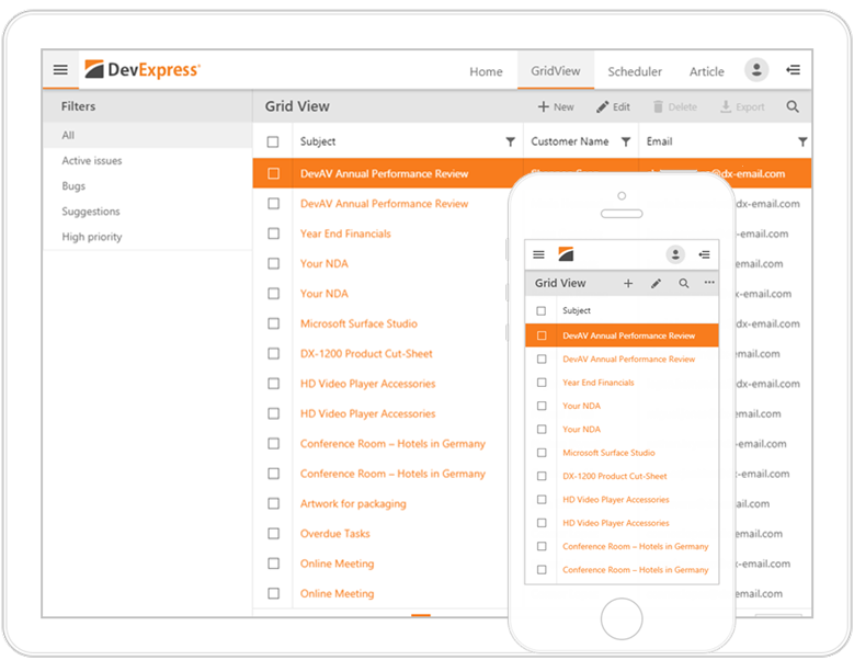
A sidebar is a collapsible panel that displays additional UI elements on the page's left or right side. In this template, sidebars are automatically collapsed. End users should click the hamburger button to invoke a sidebar on a mobile device.
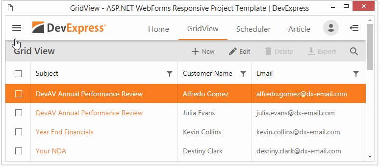
The Home, GridView, Scheduler, and Article pages include the left sidebar. The GridView page also includes the right sidebar.
The GridView and Scheduler pages include a toolbar under the navbar. Use this toolbar as a container for UI elements that should be attached to the top of the page.
The toolbar provides two adaptive modes:
-
the menu hides items' text and displays only icons
-
the menu hides its items one by one to the popup menu hidden under the ellipse button when the browser width is changed.
The toolbar implemented for the GridView page also incorporates a collapsible panel that can be used to implement filtering or searching functionality.
A fixed-height footer pinned to the bottom of the browser window.
Content Pages
The Responsive Web Application template contains four content pages. These pages provide adaptive layouts that you can use to implement the following scenarios: viewing and editing data tables, managing a schedule, administering user accounts or displaying formatted text.
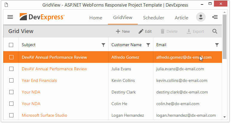
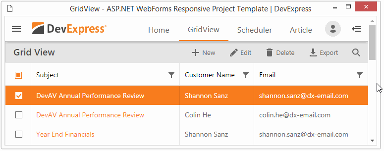
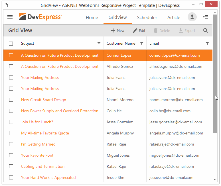
Grid View
This page demonstrates an adaptive layout that incorporates the ASPxGridView control. The page’s layout includes the following features:
- Vertical and horizontal touch scrolling
- Data pagination and the control’s built-in pager
- A left sidebar that incorporates a filtering interface
- A search panel stored in the toolbar
- An edit form implemented as an adaptive modal window
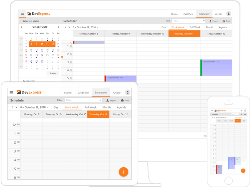
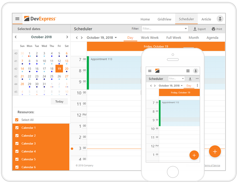
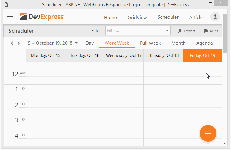
Scheduler
The Scheduler page contains an adaptive layout that incorporates the ASPxScheduler control. This page’s layout includes the following features:
-
A top fixed toolbar that stores filtering and exporting UI
-
A built-in adaptive toolbar that allows end-users to switch dates and views
-
A floating action button that provides fast access to event management
-
A left sidebar that incorporates a calendar (implemented using the ASPxDateNavigator) and the resource filtering interface
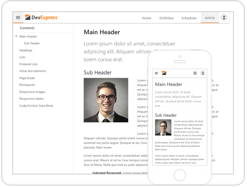
Article
The Article page demonstrates an adaptive reader for formatted texts. The page's layout is built using CSS styles and adapted for the browser's window size: margins and images are reduced for small screens. CSS styles applied to the Article page are stored in the separate file that you can use in your applications.
Sign In/Register
The template also includes sign in/register UI.
Authorized users can access their profiles by clicking on his/her photo in the top right corner. If a user's photo is unavailable, the profile icon displays a user's initials.